Skyline Visualization
Origin: Line of Balance Meets VPM
The Skyline visualization draws from Line of Balance (LOB), a technique developed by the U.S. Navy in the early 1940s and championed by GE, where it was sometimes called a "Skyline chart" for its stepped, city-silhouette appearance. LOB was originally designed for repetitive production work — plotting cumulative progress across multiple units to detect bottlenecks when downstream activities outpace upstream supply.
VPM adapts this concept for New Product Introduction (NPI) projects. Rather than tracking repetitive units, the VPM Skyline counts deliverables — the "R" (Responsible) tasks that roll up under each "A" (Accountable) summary task. The result is a stacked status snapshot that answers the question every project leader asks: "How many things are in trouble right now?"
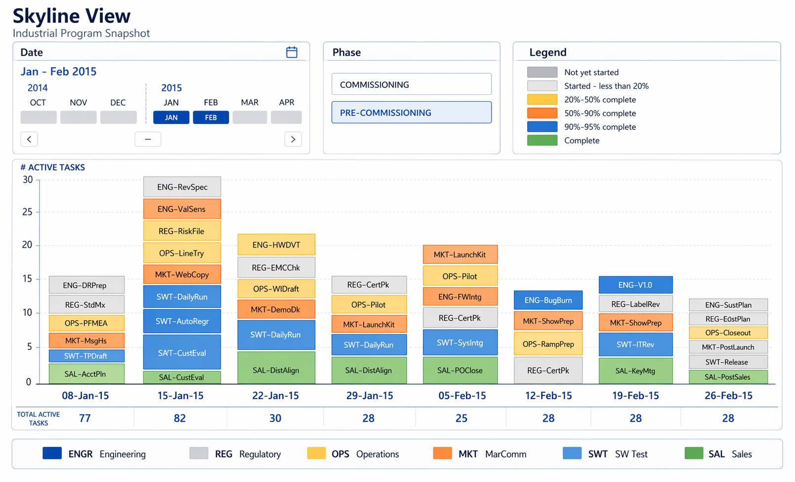
Example: skyline snapshot for an industrial program view by week.
How It Works
Equal Weighting: 1 Task = 1 Unit
The Skyline deliberately treats every R-task as equal regardless of duration. A 1-hour task and a 10-hour task each count as one unit. This is a design choice, not a limitation — it shifts the focus from how much time is at risk to how many things are in trouble. The Skyline is a health indicator, not a schedule. A swim lane owner who sees 40 out of 50 tasks in dark blue knows they're in good shape. One with 20 red tasks knows they need to act — no Gantt interpretation required.
Status Color Coding
Each R-task is classified against the commit schedule (not the overcompressed schedule) into one of four states:
| Color | Status | Meaning |
|---|---|---|
| Dark Blue | On Time | Task is current and on track against commit date |
| Light Blue | Future | Task has not yet started and is not yet due |
| Yellow | Late & Done | Task was completed, but after the commit date |
| Red | Late & Not Done | Task is past its commit date and still incomplete |
Tying status to the commit schedule rather than the overcompressed one keeps accountability honest. The commit schedule is the promise; the Skyline shows whether you're keeping it.
Slicing Dimensions
The same underlying data can be viewed across multiple dimensions, and this is where the Skyline becomes a portfolio management tool:
- By Project — A portfolio-level skyline gives leadership a one-screen health dashboard across all active projects
- By Discipline (EE, ME, SW, Operations) — Reveals whether an entire discipline is struggling across multiple projects, not just one
- By Sub-Discipline (EE-Firmware, EE-Hardware, ME-Gas Flow, ME-Packaging) — Pinpoints whether a specific capability area is a systemic bottleneck
- By Individual — Shows whether a person is overloaded (lots of red) or if a specific contributor is a recurring constraint
When a discipline shows red across three projects, that's not a project problem — it's an organizational capacity problem. The Skyline makes that visible in a way no individual project report can.
Complementarity with the Fever Chart
The Skyline and the Fever Chart are designed to work together:
| Skyline | Fever Chart | |
|---|---|---|
| Question answered | "Where are we now?" | "Where are we heading?" |
| Time dimension | Current snapshot | Trend over time |
| Unit of measure | Count of tasks by status | Buffer consumption rate |
| Best for | Identifying current problems | Predicting future problems |
Together, they give a project leader both the current state (Skyline) and the trajectory (Fever Chart). A project can look acceptable on the Fever Chart (buffer consumption within bounds) while the Skyline reveals that a cluster of red tasks in one discipline is about to cascade. Conversely, a Skyline that looks mostly blue doesn't tell you that buffer is burning faster than planned — that's the Fever Chart's job.
Implementation
The Skyline is fundamentally a stacked bar chart where each bar segment is a count of R-tasks in each status bucket, grouped by the selected slicing dimension. The status classification logic is straightforward:
- Compare each R-task's current state (complete / incomplete) against its commit schedule date
- Classify into one of the four status buckets
- Aggregate counts by the selected dimension (project, discipline, sub-discipline, individual)
- Render as stacked bars
Since VPM already tracks R-tasks, commit dates, and completion status, the Skyline is a reporting and visualization layer on top of existing data — not a new data collection requirement.
Why Equal Weighting Works
It might seem counterintuitive to count a 1-hour task the same as a 10-week task. But the Skyline isn't measuring schedule risk — that's the buffer's job. The Skyline measures execution discipline: Are teams completing what they committed to, when they committed to it?
A swim lane owner with 15 small tasks overdue has a different problem than one with 2 large tasks overdue — but both have a discipline problem that the Skyline surfaces. Duration-weighted views would bury the first case and amplify the second, when in practice, the first case (many small things slipping) is often the early warning of systemic trouble.