Visualization Principles
If you are looking for outcome evidence first, start with Proof VPM Works. This page focuses on visual design rules that improve execution control.
VPM's power comes from what it shows — and what it chooses not to show. Every visual decision in the method serves one goal: help the team see the truth fast enough to act on it. These three principles govern how VPM visualizations are designed.
Four Rules of Eliminating Motion in Visualization
These four rules keep visual management usable in real project conditions: no tiny fonts, no scrolling, no walking, and no slide flipping. If people cannot read and compare the signal in one glance, the visualization is too hard to use under pressure.
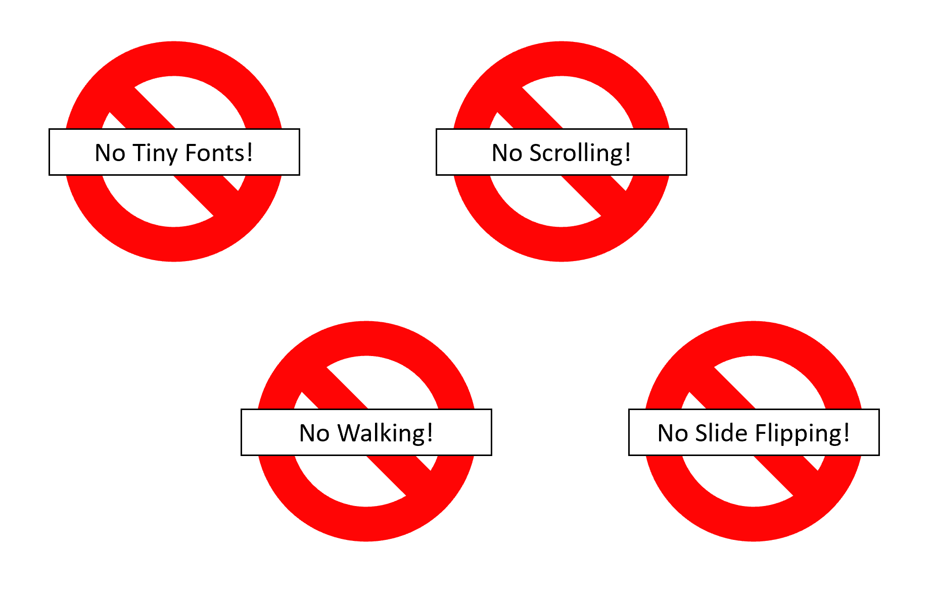
The four rules of eliminating motion in visualization
Hierarchical over Linear
A Gantt chart is a flat list. Every task gets its own line, every dependency gets its own arrow, and a minor administrative step receives the same visual weight as a make-or-break cross-functional handoff. The result is a dense, linear wall of information where nothing stands out because everything is treated equally.
VPM rejects this. Instead of showing every task, VPM organizes information in layers of importance. At the top layer, the swim lane chart shows only the tasks that matter most for cross-functional coordination: major deliverables and the handoffs between teams. These are the moments where accountability shifts — where engineering commits a build to operations, where regulatory signs off for quality, where software delivers to firmware. Everything else — the dozens of internal tasks each function manages to produce those deliverables — stays within the function, managed with whatever tool works best for that team.
This hierarchy isn't about hiding information. It's about making the critical path visible by removing the noise that obscures it. A project manager scanning a VPM swim lane chart can identify the next three handoffs at risk in seconds. The same project manager scanning a 200-task Gantt chart might need an hour — and still miss one.
Maximize Graphical Density
Edward Tufte, in The Visual Display of Quantitative Information, introduced a principle that should be tattooed on every project management tool designer's forehead: maximize the data-ink ratio. Every drop of ink on a page should convey information. White space, decorative borders, redundant labels, and chart junk aren't just aesthetic failures — they actively prevent insight by consuming space that could carry meaning.
Gantt charts violate this principle catastrophically. Each task occupies a full horizontal line regardless of its duration or importance. A one-day review task and a six-month development effort get the same vertical real estate. The result is a chart that is mostly white space — page after page of nearly empty rows connected by a tangle of dependency arrows that cross the entire document. Teams scroll endlessly, print multi-page spreads, and still can't see the whole project at once.
VPM swim lane charts achieve 5–10× the graphical density of a traditional Gantt chart. All of a function's tasks are condensed into a single horizontal lane. Tasks are sized proportionally to their duration. Handoffs are visually prominent. A single page — or a single screen — can display what would take twenty pages of Gantt output. This density isn't clutter; it's clarity. When the entire project is visible at a glance, patterns emerge that no amount of scrolling could reveal: misaligned timelines between functions, resource bottlenecks, gaps where no one is working on the critical path. The team builds consensus faster because everyone is literally looking at the same picture instead of navigating their own slice of a fragmented plan.
Clear Message
The ultimate test of any project visualization is this: can a new person walk up to it and know whether to worry — in under ten seconds?
If the answer requires reading a legend, cross-referencing a status report, or asking the project manager to interpret the chart, the visualization has failed. VPM's fever chart is designed to pass this test every time. Green means the project is on track. Yellow means buffer is being consumed faster than expected — attention needed. Red means the project will be late without intervention. There is no ambiguity, no room for optimistic interpretation, no hiding behind "we're monitoring the situation."
This principle extends beyond the fever chart. Every VPM visualization is designed to deliver an unambiguous signal. The swim lane chart shows where handoffs are at risk by making them visually prominent. The team scoreboard highlights which functions are behind. The skyline visualization shows how many deliverables are healthy versus at risk across an entire portfolio. In every case, the message is the same: act now, or the project will be late. Not "here's some data for your consideration." Not "let's discuss this at the next status meeting." A clear, visual demand for action — visible to everyone, impossible to ignore, and too honest to spin.
Dashboard View: Multiple Dimensions
Strong project dashboards report multiple dimensions at once so leaders can act without stitching together separate reports. A good dashboard combines schedule progress, flow health, output quality, and commercial or delivery outcomes in one view. The point is not to overwhelm the team with charts; it is to make cross-metric patterns visible fast, so risk signals show up early and decisions happen in time.
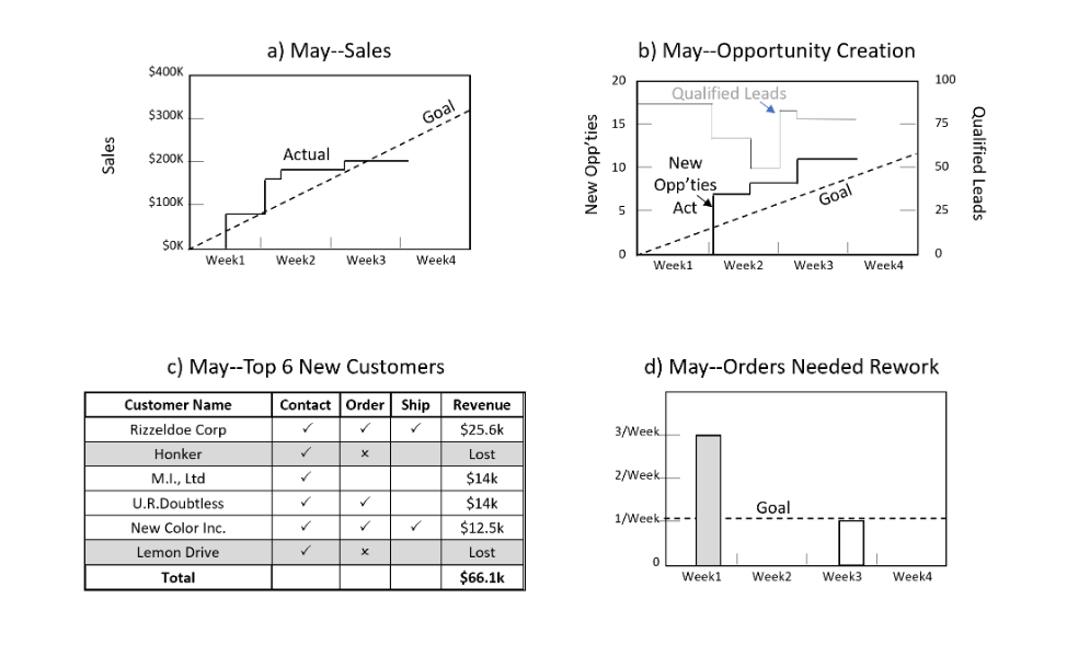
Example dashboard
The best project visualizations aren't the ones that look impressive. They're the ones that make the right people uncomfortable at the right time.
Related: VPM as a Digital Obeya — the room these views form when a team steers from them together.